I-Maps uses intuitive investment maps to show volatility and correlation together, helping investment professionals understand the structure of the investment landscape at a glance. By combining these fundamentals into a single view, the map provides immediate clarity on how assets behave, how closely they move together, and where risk is concentrated within the broader universe.
Intuitive Investment Maps
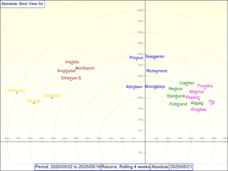
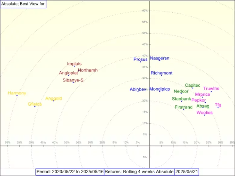
Instantly grasp the investment landscape through an intuitive map. Two fundamentals of investing — volatility and correlation — are shown together on a single visual. Volatility is represented by a point’s distance from the origin, and correlation by the angle between two points. The maps’ clarity makes them valuable to newcomers, experienced professionals, and clients alike.
View Different Investment Universes
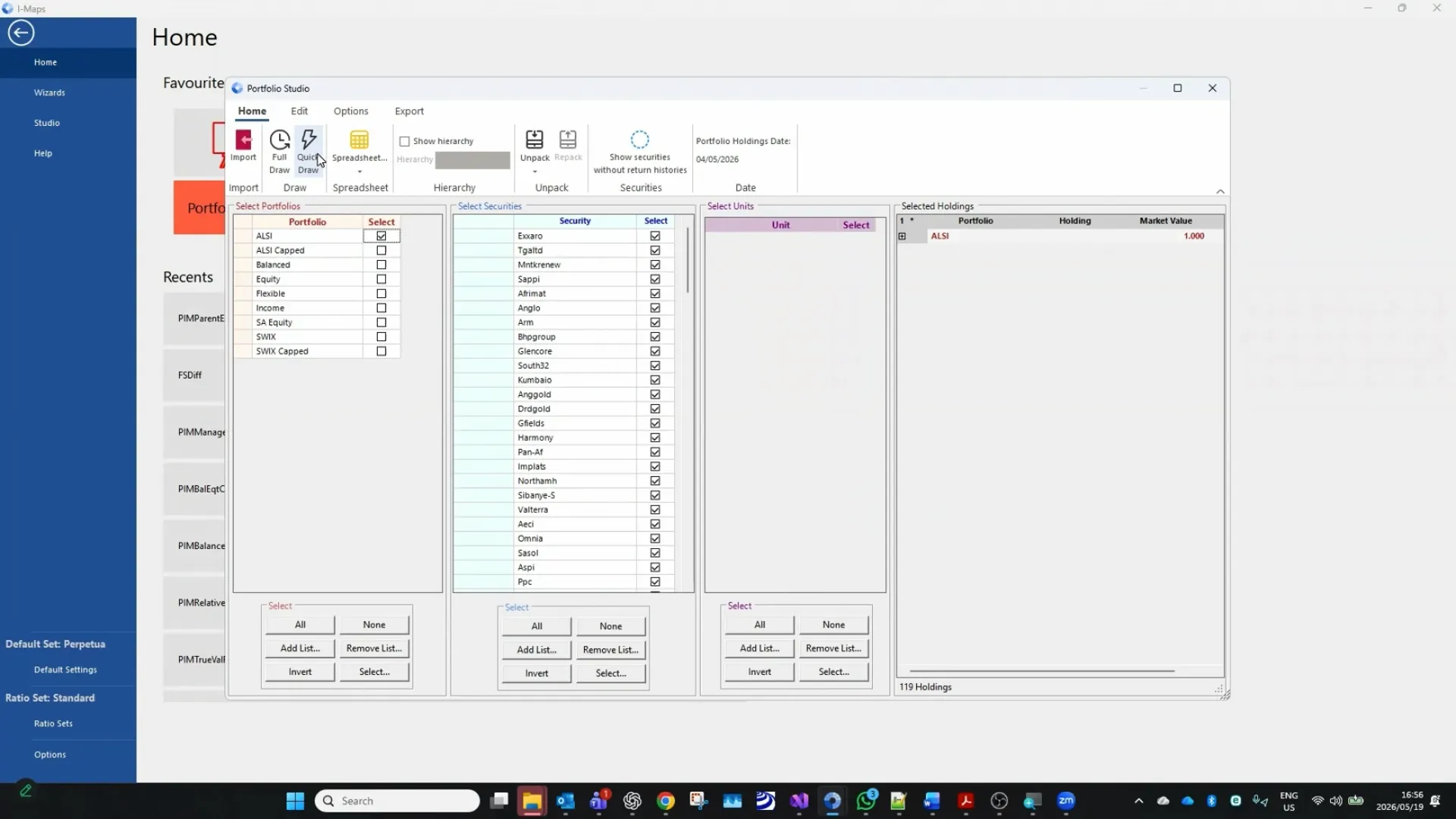
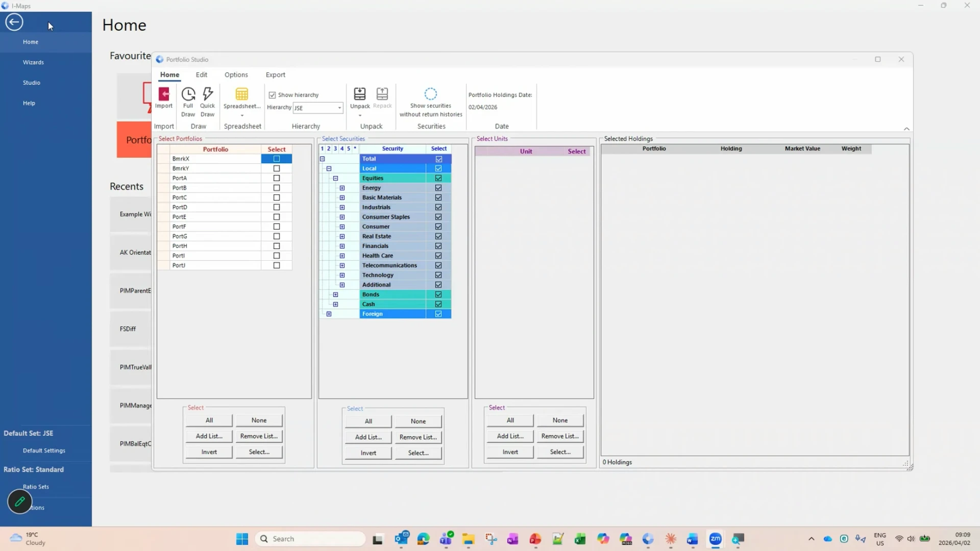
Customise the map to display your chosen investment universe, from local to global markets. Allowing teams to analyse portfolios within the correct context, switch between different universes as needed, and compare positioning across regions, mandates, or peer groups. By adjusting the universe view, investment teams can build insight faster without rebuilding analysis from scratch.
Portfolio Positioning on the Map
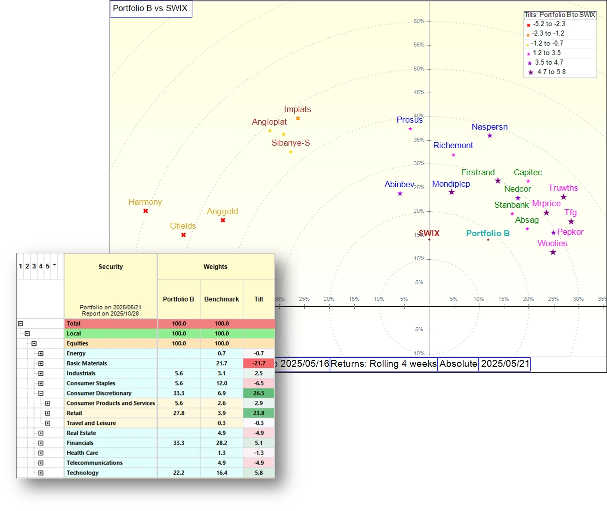
See where your portfolio sits within the investment universe alongside peers and benchmarks. This makes it easier to interpret portfolio structure and understand whether positioning is defensive or aggressive relative to the opportunity set. A single glance can provide clarity on exposure patterns, risk concentration, and how portfolio decisions compare to peer portfolios.
Change Your Point of View
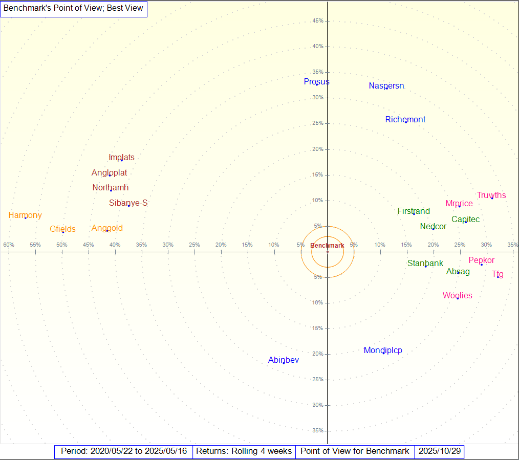
Re-centre the investment universe around any chosen benchmark to view positioning relative to it. This perspective is particularly useful when assessing active risk, as it allows you to interpret portfolio behaviour against a reference point rather than in isolation. By shifting the view, teams can better understand active decisions, evaluate differences, and communicate positioning more clearly.
View Active Positions and Tilts
Identify areas of risk concentration and diversification opportunities with clear visual indicators for overweights and underweights relative to a chosen benchmark. Active positions become easy to interpret, supporting faster insight into where risk is building, which exposures are driving differences, and where a portfolio may be unintentionally crowded.